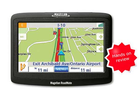
The Magellan RoadMate 1412 is one of Magellan’s most popular GPS navigators.The 1412 has a 4.3″ color touch screen, pre-loaded maps of the entire U.S. and Canada, and 6 million points of interest (POIs). It also features text-to-speech, so you’ll hear “approaching right turn, Maple Street” instead of just “approaching right turn.”
Moving up to the RoadMate 1430, you get live traffic added to these features. Going the other direction, the RoadMate 1400 drops the maps of Canada, loses text-to-speech, and includes only 1.3 million POIs. To see how the 1412 stacks up against other units, check out my Magellan auto GPS comparison chart.
Magellan RoadMate 1412 Interface
The RoadMate interface is basically the same as that found on Magellan’s Maestro series.
Compare prices on the Magellan RoadMate 1412
A slider bar on the right side of some menus allows you to scroll through large lists. Unfortunately, it is not available on POI screens, where it would be very helpful. Within a POI category or POI search results, you have to plow through the entries one at a time.
One feature I like is being able to access the volume controls from the map screen. I also appreciated the ability to enter cities by zip code. Previous cities are presented as an option when entering an address, but not when searching for POIs.
The 1412 has both favorites and an address book, allowing you to segregate more and less frequently visited destinations. You can reach the main menu from any menu screen by holding down the back button, though it says “cancel” when you do so, possibly leading you to believe that it canceled the previous commands.
Magellan RoadMate 1412 Navigation
There are several things that the RoadMate 1412 gets right when it comes to this core function:
- It calls out if the destination is on the left or right
- Magellan’s QuickSpell feature simplifies input by graying out invalid characters when spelling out an address
- As you near a turn a chime sounds as a final reminder to turn; I found this feature helpful
I have mixed feelings about some of the unit’s navigation features though. One is the fact that you are presented with route options each time you choose a destination (see screenshot below). On the one hand, it gives you a bit more control over preferred routes. Then again, it’s another tap every time you want to route to a destination. It would be nice to have a way to opt out of this in the user settings. In testing this feature, I tried to avoid going through the heart of downtown by choosing “Most Use of Freeways;” sometimes it worked and sometimes it still routed me through town (as did the Fastest Time option), even though freeways were definitely the fastest option. (Screen shots courtesy of Magellan)
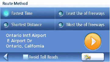
Note that you can tap the Re-route icon on the main menu to bring this screen back up.
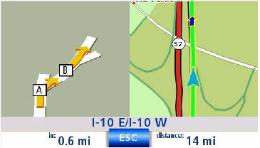
A split-screen appears as you approach a turn or series of turns as shown below. You have the option of disabling this feature.
By tapping the next turn icon on the map screen (shown below in the lower left corner of the screen), you can bring up the maneuver list.
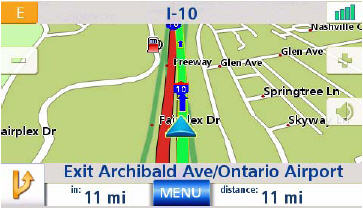
Then, by selecting an individual maneuver (see below), you can (theoretically at least) exclude a road from the route.
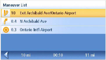
There are a couple of problems with this. One, if you want to exclude N. Archibald Ave. from the route, you would actually need to tap the item below it. Talk about counter-intuitive! Second, it didn’t work well for me. Sometimes , it would put me on the same road section I asked it to avoid, routing me to it in a different way. Other times it would send me way out of the way, avoiding a very direct alternative route.
Another “mixed bag” feature is multi-destination routing. In actuality, this is little more than a way to store POIs and addresses for a particular trip. It does not automatically route you to the next destination. The 1412 does however offer a “route optimization” feature.
Route recalculations were moderately fast.
Unfortunately, there are some negatives associated with the interface that showed up while navigating with the 1412:
- Sometimes the unit didn’t stop routing when I arrived at my destination.
- You can’t search for a new destination without canceling the current route first (and you are asked to confirm the cancellation too — yet another tap). One exception is Exit POIs, which are discussed later.
- The split-screen turn preview came up ahead of turns, but went away well before actually reaching the turn.
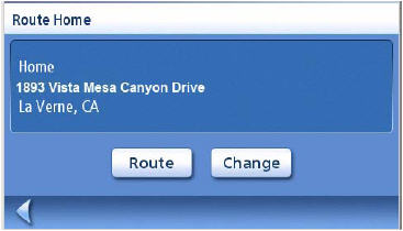
- Key functions can require too many taps. Though there is a home icon on the main menu, it takes three taps to start navigating to home. First you tap the home icon, then you are presented with the screen below. Then you’ll get a screen asking you to choose your routing method (fastest time, shortest distance, least use of freeways, most use of freeways). If you have to cancel a route first, it takes even more taps to begin routing to home.
- The map does not switch to 2D automatically if you drag it to pan. You can pan in 3D when navigating by tapping on the map, but it is not a very effective way to browse the map. To get to 2D mode, you must go into user settings. Using shortcuts like the slider bar and holding down the back button, it still took ten taps for me to get back to the map screen when changing the mode to 2D. You can however pan in 2D when viewing a POI. One tip here — when panning the map, tap in the center
of the cursor to route to a map point or to save it. - You cannot search for POIs along your route, near your destination, or near a point on the map, but you can search for POIs near an address, a city or your current position.
- Previous destinations and My Addresses are found under “Enter Address.” You quickly get used to this but it is very unintuitive for the first time user.
- There is no option to have the 1412 call out the next turn verbally, though you can see the maneuver list. I prefer how this is done on the Garmin nuvi, where you don’t have to look at the screen; just tap and listen for how far away and which direction the next turn is.
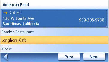
- POI screens can also be confusing. Details for the highlighted POI in the image below show up at the top of the screen. But you can’t tap there to route to it. You must tap the highlighted item in the list. I’m curious as to why they didn’t set it up so you could tap the details area too.
Magellan RoadMate 1412 navigation glitches
I did come across a couple of situations where the 1412 just wouldn’t work. Fortunately, it was easy enough to get the device to do the task.
One time it wouldn’t navigate my route; it kept going back to the maneuver list instead. I had to cancel the route and re-enter my destination.
Another time I got a message that it couldn’t route to a location in my home town using it’s existing maps. Once again, re-entering the destination corrected the glitch.
Exit POIs
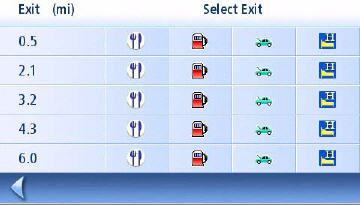
The exit POI feature, designed to give you quick access to key POIs at upcoming freeway exits, is very useful The only quibble I have is that it doesn’t list the exit number or highway name/number, it only shows the miles to the exit. To use exit POIs (available from page two of the main menu), simply tap a POI icon on the screen shown below. This feature can only be used on limited access highways.
Magellan RoadMate 1412 Pros
- Includes text-to-speech to call out street names for upcoming turns
- Calls out that the destination is on the right or left
- The unit comes on automatically upon starting your car
- QuickSpell feature speeds data entry
- Allows for zip code entry in addition to spelling out city
- Address entry screens allow you to choose previous cities
- Can access volume control from map screen
- Exit POIs is a useful feature
- You can select categories of POIs to show on the screen, and you can tap them to route to them
- Includes a backup and restore function
- It is easy to both secure the unit into and release it from the mount
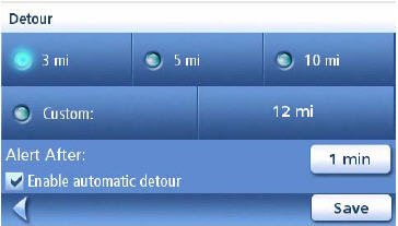
- You can customize automatic detour options that will kick in when you are sitting still in traffic (see image below)
Magellan RoadMate 1412 Cons
Note that these are in addition to the navigation problems listed previously.
- The unit rarely held battery power away from the car; it seems to go into suspend mode when the power button is pressed or held down, rather than truly powering off
- The Back button didn’t work during setup; it kept advancing through setup screens
- It does not display the highway speed limit
- Many functions require too many taps
- Some menu items are unintuitive
- Map screen does not show your current speed while navigating
More Magellan RoadMate 1412 reviews
- Dozens of consumer-authored Magellan RoadMate 1412 reviews
have been posted at Amazon
- More consumer-written Magellan RoadMate 1412 reviews are posted at CNet
- Personal Electronics Buzz has posted their own Magellan RoadMate 1412 review
- There is a Magellan RoadMate 1412 review thread at GPS Review (and another)
- Patrick Chang reviews the RoadMate 1412
I’ll be posting more hands on GPS reviews as they appear, but in the meantime, here are some…
Other Magellan RoadMate 1412 resources
- A PDF version of the Magellan RoadMate 1412 owners manual
- Want to see how the 1412 stands up against other units? Use this handy Magellan auto GPS comparison chart.
- A Magellan RoadMate 1412 FAQ
- Our other Magellan auto GPS reviews
- There is a Magellan RoadMate message forum at GpsPasSion
- There is also a Magellan GPS message forum at Yahoo, and an alt.satellite.gps.magellan UseNet group
- The official Magellan RoadMate 1412 web page
Compare prices on the Magellan RoadMate 1412 at these merchants:
- Check the current Magellan RoadMate 1412
price at Amazon
- Get the
Magellan RoadMate 1412 Wide-Screen Automotive GPS System with North American Maps
at TigerGPS, where you get free shipping on orders above $250
- Get the Magellan RoadMate 1412 for an amazing price on eBay
- Check out our GPS deals site for current specials and rebates on a wide range of GPS receivers
- Scroll down for more live price comparisons

Hiya Tracky,
I’m making the rounds just in case you didn’t get an email invitation. Our email database is spotty at best.
The Extravablogiversapaloozathon 2008 is September 27th, and we’re hoping every area blogger will come!
Party Info here.
BlogAsheville awards nomination thread here.
RSVP thread here.
(oof – no html on the Typepad… Well, please head over to BlogAsheville for all the details. See you there!)
I’ll be there, hopefully with my stealth-blogger wife in tow.
BTW, I’ve got it set up for HTML URLs to auto-convert. Works on TypePad if the blogger allows it.