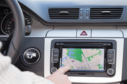
 The National Highway Traffic Safety Administration (NHTSA) has issued “nonbinding, voluntary NHTSA Driver Distraction Guidelines.” Included in the guidelines is the call for the elimination of moving maps:
V.5.bDynamic map displays. The display of either static or quasi-static maps (quasi-static maps are static maps that are updated frequently, perhaps as often as every few seconds, but are not continuously moving) for the purpose of providing driving directions is acceptable. Dynamic, continuously-moving maps are not recommended.
The display of continuously updated distance to turn, ETAs, etc., may be okay, thanks to to the use of the term “scrolling” in the following section:
V.5.eAutomatically scrolling text. The display of continuously moving text is not recommended. The visual presentation of limited amounts of static or quasi-static text is acceptable
I can’t really see GPS or auto manufacturers changing to static map displays. What do you think?
Via Pocket GPS World.

As long as these guidelines are voluntary I don’t have a problem. When municipalities begin to impose GPS bans is when I have a problem.
GPS units are different than cell phones because GPS ties into the process of navigation which is engaged the second we sit down in our vehicles. Knowing where I am in relation to my environment in real-time provides we with a greater awareness and ability to concentrate on the act of driving. Like anything, if undue distraction is required to figit with something just pull over until the figiting is done.
At some point it must be left to the individual to exercise prudence while driving.
Here we go again…the Fed trying to control every aspect of our lives. Do they not think it’s safer for us to be forewarned on what lane to be in to take the proper exit or ramp on an interstate than to make a last second switch? Would they rather me stick a folded map beside me in the seat and keep referring to it? I think it’s about time the fed used some common sense, for a change!
A static display for a guidance display is almost useless. In town I often glance a the display to see if I am at the correct intersection for a turn. In many towns you really need this since the street name signs are obscured by things like improper placement, vegetation, or advertising stuff.
If anything a MORE dynamic display would be helpful.
I don’t see how these new guidelines really improve things. A driver that would be distracted by dynamic maps would be distracted by more static maps. People who know how to drive wouldn’t have a problem with either. Really, this appears like a non-issue and a waste of time for the federal government. I mean we are talking about maps that are updated continuously versus maps updated every few seconds. It doesn’t make much different when it comes to distracted driving.