Apparently it’s video week at GPS Tracklog. I’m still learning iMovie after my recent move to Mac, so I’m not claiming pro quality.
The intro/outro is thanks to Jose Castillo and his awesome new waterproof video camera.
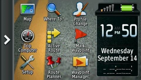
Of course after filming this, I learned how to eliminate the problem of icons only with no labels on the main menu, thanks to a helpful reader. You can apparently add up to five main menus! Here’s a before pic… 
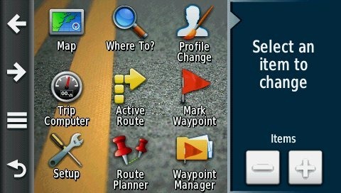
To get started, go to Setup > Main Menu. Now tap one of the arrows shown below on the left side of the screen.
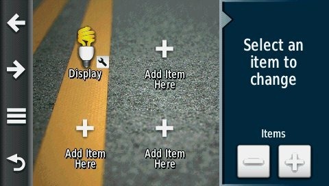
Then, as shown below, tap Add Item Here and choose from the available categories (Applications, Shortcuts, Setup, Where To?). I chose Setup > Display, to make it easier to toggle screenshots on and off. The area on the right (Select an item to change), allows you to increase or decrease the number of icons available on the screen – you can have 4, 9 or 16.
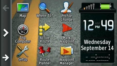
Once you’re done, you’ll see arrows on the side of the main menu, as shown below, allowing you to switch between menu screens…
Pretty cool, huh?


When you think about it, the “drawer” is just a different way to organize frequently used functions on the unit. You can accomplish the exact same thing, with the exact same number of screen taps by using multiple menu pages (opening the drawer takes one tap, flipping to the next screen takes one tap). So it’s just a question of which option you personally like. This is one of the great things about the Montana, there are almost always more than one way to accomplish a given task, due to the high level of user customization.
When using the setup > main menu function, have you noticed that the contextual menu (3 bars) allows you to choose which of the multiple main screens is “home”? Another item on the contextual menu is called “setup drawer” and lets you do the same kinds of things with the drawer.
One bug (or “feature”?) that annoys me has to do with the main menu dashboards. One of the options is “none”, and that gives you a main menu with no dashboard at all. However you can’t put additional menu icons into that area, it just remains blank. I am running old system software, so maybe they fixed this in the newer versions? But it would be nice if we could completely do away with the main menu dashboard and have more room for screen buttons.
No fixes yet. Same issue here on 3.30. Looks like it’s a system wide option and they may just not have considered allowing extra icons on the main menu when choosing this.