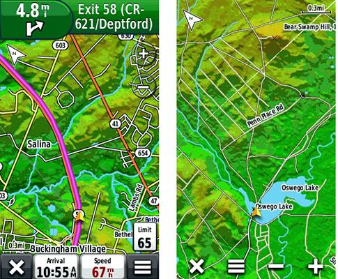
Frequent commenter Boyd Ostroff, who keeps cranking out amazing Garmin-compatible maps, has just published a LIDAR-based map of a portion of southern New Jersey. I’m hoping we’ll see more of these for other areas, as the elevation detail is amazing.
I’m putting this under the handheld category but want readers to be aware that such maps should work fine on a nuvi. Boyd was kind enough to answer a couple of quick questions I posed, giving our readers some insights into LIDAR-based cartography:
Is the LIDAR elevation data more accurate?
See: http://stephencreek.com/gpstl/elevation.png
I think the LIDAR elevation data is highly accurate. Look at this example where the original full resolution data is shown at 24k scale on the left. On the right you see my conversion to polygons. While I could come very close to the original, and it works well in Basecamp, the gps devices just choke when the polygon count gets too high.
The current version shows approximate elevations when you mouse over the map, but they aren’t very accurate. For the next version, I’ve come up with a system of very accurate data for every polygon on the map. The spreadsheet below the map shows the data available for every polygon, and the map above shows average elevation. On the actual map, I won’t do this because it’s too cluttered, but when you mouse across or click, it will be displayed. I’m thinking to only display the average elevation… or do you think there would be value to also showing the minimum, maximum and slope?
Why did you choose color gradation over contour lines?
Well, for one thing, I’ve already used the same LIDAR data to generate the contour lines on my recent NJ 2012 map 😉
see: http://stephencreek.com/gpstl/PinesLE_vs_NJ2012.png
Aside from that, the Pines LE map really serves a different purpose. Compare the two in that image; right away you get a feeling for the terrain. And it also starts you thinking about what created it – you can see how the streams etched their way into the landscape, and imagine how water once covered the low elevations.
You need to know a bit about the area I have mapped; the full range of elevations goes from sea level to only 74 meters. So I show the full range of colors through this small range. That exaggerates the terrain quite a bit – you might not even notice the things that looks like “mountains” here while driving around. Ed Campbell, a member of a local forum (njpinebarrens.com) summed it up very nicely: “I know the contrast is way up but the topography has my imagination in overdrive. I was half blind before. I have lots of geology questions.”
Look at this comparison with Garmin’s 24k topo. It has shaded terrain but it’s barely perceptible here, because the range of elevations isn’t enough to register on a map that also contains 3000 foot mountains. Of course, that also forces this to be a regional map with nothing higher than 74 meters. BTW – the gold triangle you see in this image is McGuire Air Force Base. 🙂
see: http://stephencreek.com/gpstl/boyd_vs_garmin.png
Aside from creating this particular map, one of my goals was to convert raster imagery to Garmin’s vector format on a large scale. The map covers about 5,000 square miles (87 quads) at 24k resolution (arguably better)…I don’t recall seeing a comparable project before. And I also wanted it to perform well on the gps through a wide range of zoom levels – even in track-up mode at highway speed while overlaid on Garmin City Navigator.
See image at right.
It took awhile to figure out, but my secret sauce is a FileMaker Pro relational database I wrote to analyze the polygons, associate them with the map colors and optimize/compress the terrain data. There are a couple programs – MOAGU and Mapwel – that also turn raster images into vector maps, but they really aren’t conceived for large projects and wouldn’t have given me as much control. Typically, the maps people make with these produce large files, don’t cover a very large area and only work through limited zoom ranges. I used Globalmapper for the “heavy lifting” and my database to put it all together.
Here’s an image showing the map looks through a wide zoom range. I didn’t want to see “pixels”, so I developed a technique to create smooth polygons for the little details. When you zoom in close, it looks more like abstract art, but it isn’t blocky. Zoom in farther and the polygons start to look jaggy – this is a combination of the fact that Garmin’s format only uses 32 bit coordinates plus my simplifying the polygons to keep file size down.
see: http://stephencreek.com/gpstl/zoom.png
I think I can use the same techniques to turn other forms of raster imagery into Garmin’s vector format, on as large a scale as needed. This map has tiles that correspond with the boundaries of USGS 24k quads. The majority of the individual .img files are in the 1.0 – 1.5 MB size range. Only 11 of the 87 tiles in the map are larger than 2 MB.

