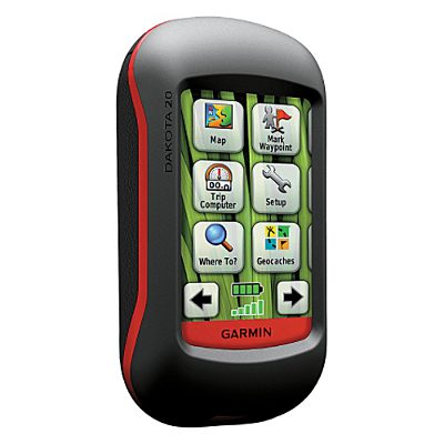
Hands on with the Garmin Dakota 20
The Garmin Dakota 20 is a smaller version of Garmin’s successful Oregon models. It appears poised to replace the eTrex series, bringing all of the Oregon’s touch screen goodness while retaining the eTrex’s small form factor, light weight and long battery life.
Both units in the two-model Dakota series sport a 2.6” screen. On the Dakota 20, you get a tri-axial electronic compass, barometric altimeter, wireless data transfer between units and the ability to accept a micro-SD card, all features lacking on the Dakota 10. Neither model comes with pre-loaded topo maps.
EDIT: The Dakota 20 also supports Garmin’s new BirdsEye aerial imagery.
Comparing to the Oregon series
Before we get into the details, let’s compare the Dakota to the Oregon series. The Dakota units have (theoretically) longer battery life and weigh less (5.25 oz. vs. 6.8 oz.), while the Oregons have a larger screen (3.0”) and add 3D views, Wherigo support, a photo viewer, and NMEA / Spanner support.
To see how the Dakota 20 stands up against other Garmin models, check out my Garmin handheld GPS comparison chart.
The image below (Dakota, left; Oregon, right) compares how screen size affects the area you can see covered in terms of map display. 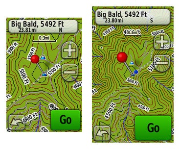
The other difference worth mentioning is screen visibility…
Touchscreen display
While the Oregon has a brighter backlight, the Dakota is a bit more visible under daylight and outdoors conditions. All of the newer generation high-resolution GPS screens suffer a bit when it comes to visibility, but it seems like Garmin is making some progress in this arena. I do a fair bit of mountain biking, and the Dakota is the first hi-res touch screen unit I consider suitable for fixed mount, non-powered use (e.g., bike handlebars). Visibility isn’t a big deal when you carry one of these units in your hand, as you’ll intuitively tilt it for the best view without thought. Nor is it an issue when powered with a car adapter, etc. But after being disappointed with previous touch screen models, I was pleased to see how readable the display was on my bike’s handlebars, even when wearing tinted glasses.
Visibility was good in direct, full sunlight (there were points where it was as bright as my 60CSx in full sun). It looked great in dark shade too. The Dakota screen’s performance was weakest at points in between – light shade or indirect light.
A couple more comments on visibility – my testing was done with the backlight on; I expect this is how most people will use it. I kept it set to time out at two minutes. The other point is that maps can dramatically affect visibility. Garmin’s Topo US 2008 is beautiful, but the green background in national forest and park areas makes it much less legible (see below at left). The free 1:24,000 scale topo maps available from GPS File Depot (example below at right) generally do not have this, and they can improve visibility significantly in marginal lighting. 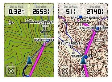 This is a bit off-topic, but it sure would be nice to have a low profile handlebar mount that would allow you to adjust the angle, in two planes, on the fly.
Before leaving the subject, I’ll add that I recommend using a screen protector for handheld touchscreen GPS receivers.
Garmin Dakota 20 interface
The interface is basically the same as that of the Garmin Oregon, with a main menu of 24 items spread across four screens (see below). It’s pretty intuitive and easy to use, but it gets much better if you take the time to customize it. Here are some tips:
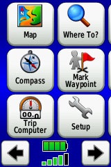 Use profiles – There is a “Change profiles” item on the main menu, and you can create a new one via Setup > Profiles. Tap the new profile to give it a name. Now start changing various preferences. Want track up when geocaching and north up when biking? No problem. The possibilities are nearly endless.
- Rearrange the main menu – Set this different for each profile. I make extensive use of the Track Manager, so that gets moved to the first main menu screen for my hiking and biking profiles.
- Create sun and shade profiles – A great use of this tool is to create a sun profile (perhaps even one for each activity). Create this profile and then go to Setup > Maps > Advanced Map Setup. Set Shaded Relief to Do Not Show to enhance visibility in bright light. Credit GPS Fix with originating this tip. EDIT: Another great tip from Scott (GPS Fix) is to “go to Setup>Map>Advanced Map Setup>Zoom Levels>Land Cover and turn it off you shouldn’t see the green background any longer.”
The keypad is a little more cramped on the Dakota than the Oregon, due to the smaller screen, but I found that I quickly got used to this and it did not result in a significant increase in errors.
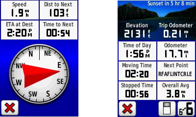
Shown below are the compass and trip computer screens. The data fields can, of course, be customized, as can the background color. The trip computer screen can be also switched to show fewer (but larger) fields.
Finally, here’s a random interface tip… When you select a location on the map, a push pin appears. You can now slide the map around underneath the pin, and zoom in as needed, to fine tune the selected location..
Route, Track and Waypoint management
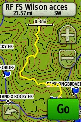 The Dakota 20 has the same excellent route, track and waypoint management tools found on the Oregon series. These include:
- Waypoints – The ability to project a waypoint, and to reposition one at your current location.
- Tracks – You can choose to hide or show a track on the map and give it a custom color (17 colors are available). The image at the right shows the View Track preview option.
- Routes – You can view a map of the entire route, edit the route, reverse it and view an elevation plot.
Dakota 20 tri-axial compass
Having a tri-axial compass means you don’t have to hold the unit level while navigating. Here’s a quick video showing the calibration process:
Geocaching with the Dakota 20
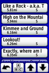
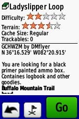
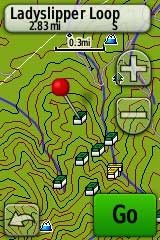
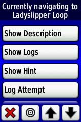
The Dakota is set up for full paperless geocaching support, meaning you can see the description, logs, and hint, and you can log your attempt (find, DNF, etc.) for later transfer back to geocaching.com. Speaking of which, full access to these features requires a premium membership at geocaching.com. Shown below, clockwise from top left: Closest geocaches, geocache description, menu for a specific cache, and preview map.
Wireless data transfer
The Dakota 20 is capable of wireless data transfer with other compatible Garmin units. You can transfer waypoints, tracks, routes and geocache summaries (paperless caching details cannot be transferred).
Free maps and custom maps
One of the nice things about the Dakota are two types of free maps for them….
GPS File Depot, mentioned earlier, has 1:24,000 scale topo maps posted for most of the US. I included a screen shot for one of these above in the touchscreen display section of this review.
Also of note, is the new ability to create and load custom raster maps to Garmin Colorado, Dakota and Oregon units, using their latest beta firmware.
GPS receiver and battery performance
Battery life was tested using fully charged 2,000 mAh Eneloop NiMH rechargeable batteries. Results ranged from 16 to 16.75 hours, without backlight use, under light canopy. Interestingly enough, the longer figure was achieved using the Alkaline battery type setting. I’m not sure this is any better than my Oregon 400t, which is only rated for 16 hours vs 20 hours for the Dakota. Perhaps this will be improved in a future firmware release.
Satellite lock was achieved in 14 seconds, with testing done under no canopy.
In tests for accuracy, the Dakota 20 performed very well. A sample comparison is shown below, matching it up against the Garmin 60CSx. Track point collection was set for five second intervals on both devices. This test took place under fairly dense canopy.
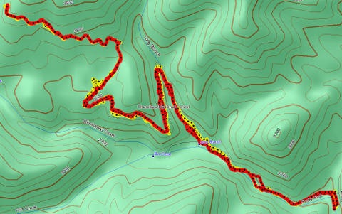 Since it’s very difficult to see the relevant details in such a small image, I’m providing links below where you can download the .gpx or .gdb (MapSource) files below. The 60CSx is in yellow and the Dakota track is red. While the Dakota went wide at one point by about 140 feet, the 60CSx exhibited much more “spidering” during stops, wandering around 240 feet at one point. Maybe my 60CSx is showing signs of age, but regardless of the comparison, I was quite impressed with the Dakota’s performance.
The track files are available at:
Garmin Dakota 20 pros
- Compact and light weight
- Tri-axial compass
- Barometric altimeter
- Great touch screen interface
- Slightly better sunlight visibility than Oregon series
- Ability to customize display and menus using profiles
- Excellent track management tools
- Paperless geocaching support
- Availability of free maps
- Accepts Garmin custom raster maps with v 3.22 beta
- Good battery life
Garmin Dakota 20 cons
- Much poorer sunlight visibility than eTrex and GPSMAP color units
- Small screen limits map area that can be seen
Recommendation
Highly recommended. The Dakota 20 is the first touch screen unit I’ve found suitable for fixed-mount, non-powered use (e.g., mountain bikes). It will also appeal to those looking to economize, or folks desiring a lightweight or more compact unit than the Oregon series. The Dakota is a great choice for hikers, bikers, geocachers and just about any other category of handheld users.
More Garmin Dakota 20 reviews
- Consumer-authored Garmin Dakota 20 reviews
have been posted at Amazon
- About.com gives a 4 out of 5 star rating in their Garmin Dakota 20 review
- A first impressions review of the Garmin Dakota 20
- Comparing the Garmin Dakota 20 to the DeLorme PN-40
- The Search Jaunt offers a brief review of the Dakota 20
- Testing the Dakota 20 on the ski slopes
- GPSInformation.org has posted a thorough Garmin Dakota 20 review
- BikeRadar gives a 3-1/2 out of 5 star rating in their Dakota 20 review
- RickRukes007 has posted a four part video review of the Garmin Dakota 20
- A Garmin Dakota 20 review on the Great Wall forum
- A Dakota 20 review from the creator of TopoFusion.com
- Lets Go Mobile has posted their own review of the Dakota 20
- Geocacher reviews of the Garmin Dakota 20
- A Garmin Dakota 20 review from a Laplander
I’ll be posting more hands on GPS reviews as they appear, but in the meantime, here are some…
Other Garmin Dakota 20 resources
- The Garmin Dakota 20 owners manual, in the language of your choice
- Compare the Dakota 20 to other Garmin mapping units
- This Garmin Dakota wiki includes a message forum
- An interactive Garmin Dakota demo page
- The official Garmin Dakota 20 web page
- Garmin Dakota training videos
- It’s pretty rugged according to this mountain biker
Compare prices on the Garmin Dakota 20 at these merchants:
- Check the current Garmin Dakota 20
price at Amazon
- Find the Garmin Dakota 20 at GPS City, one of our favorite low cost vendors
- Check out the deal on the Garmin Dakota 20 GPS
at REI.com, where satisfaction is guaranteed and members get 10% back on eligible purchases
- Buy the Dakota® 20
direct from Garmin
- Find the Garmin Dakota 20 Touch-Screen Handheld GPS Receiver
at TigerGPS, where you get free shipping on orders above $250
- Get the Garmin Dakota 20
for an amazing price on eBay


[…] Garmin Dakota 20 review | GPS Tracklog – Garmin Dakota 20 review including comparisons to similar units, links to other reviews, price comparisons, owners manual, message forums and more […]