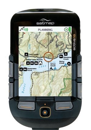
 The Satmap Active 10 TREK
 has finally come to the US, four years after its introduction in the UK. And what a difference four years makes. We didn’t have touch screen Oregons then, and super-thin iPhones and GPS receivers with raster imagery were just starting to be seen. But in 2011, the Satmap is reminiscent of the tech of yore, feeling more like a clunky PDA than a cutting edge piece of gear.
Quick links
More Satmap Active 10 Trek reviews
Satmap Active 10 Trek resources
How much does it cost?
To be fair, like most handheld GPS receivers, there are good things and bad things about this one. So lets take it one step at a time, starting with…
Satmap Active 10 TREK hardware
The Satmap doesn’t have a touchscreen. Instead, there are six buttons and a joystick on the front (see above). The left and right ones actually wrap around the side a bit, so that you can depress them laterally, aiding one hand operation. Even so, I found using it with one hand awkward, and in some instances very difficult. The joystick can also be a bit problematic as it is easy to move in a menu list if you use it to click to enter (though you can typically use one of the buttons to enter an item).
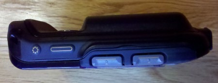
On the right side of the device is a power button and a backlight boost (see image below). I like the latter feature and wish that other brands had it. Press it and you get a quick boost of brightness, without having to change settings. This is one of several innovative and nice features found on the Satmap.
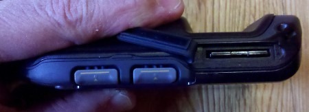
The left side contains an SD slot under a flap, instead of where most manufacturers place it, in a sealed battery compartment. This may be responsible for another of the device’s weaknesses – it is not waterproof, sporting instead an IP65 weatherproof rating, meaning it cannot be submerged.
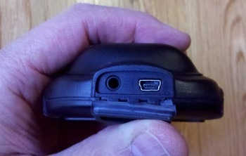
On the bottom, we find a flap concealing a mini-USB connection and headphone jack.
The unit comes with both a rechargeable li-ion battery and a 3 AA battery caddy (my test unit did not include the latter, but it’s listed on their website as included). Weight of the test unit was 8.1 ounces, with the rechargeable li-ion battery pack installed.
Satmap Active 10 TREK display
The large 3.5” screen gives a lot of map real estate, another nice feature. In deep shade, visibility was pretty good, perhaps even better than my Garmin 60CSx and Oregon 450 (though not as bright as the Garmin 62s or the recently tested Magellan eXplorist 710). In testing it against those four units in bright sun, the Satmap comes in dead last though. This is true when looking at the display at the best angle, and when checking visibility for the range of angles where the display was useable. The Satmap definitely had the worst glare of any. It could be as bad as the Garmin Colorado or first generation Oregons, but I no longer have any of those available for side-by-side testing.
National Geographic TOPO maps
Before I get into the interface, I want to briefly discuss the maps that are available for the Satmap, which utilizes National Geographic TOPO map SD cards in the US. The 1:24,000 scale state series is available for many states and regions, with more slated to follow. But the $99.99 price is one of the great downsides to this device; if you travel much, this could quickly get very expensive!
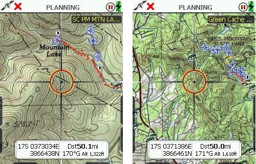
A couple of screenshots from the North Carolina / South Carolina map are shown below. The quality is very good, with the map automatically switching to 1:100,000 and 1:250,000 scales as you zoom out. It is really nice to be able to continuously zoom raster maps without things getting too grainy, losing focus, etc.
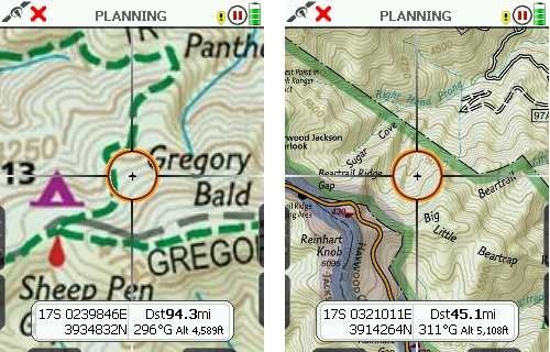
Also available are Trails Illustrated regional maps. Current titles are America’s Greatest Nation Parks, Sierra Nevada and Southern Appalachians. Screenshots of the latter, which I tested, are shown below. The scale is mixed on these. On the Southern Appalachians map, the scale is 1:75,000 over most of the map (at left below), and 1:50,000 in the Pisgah National Forest area (at right).
SatMap Active 10 TREK interface and features
When I try out a new handheld platform, one indication of intuitiveness is how often I have to refer to the manual. In my recent test of the Magellan eXplorist 710, it was rare; with the SatMap I felt the need to read it cover to cover. Nearly two months into testing, I still wasn’t sure how much of that was about poor design and how much was about the fact that the SatMap is a powerful device with unique features, but both are definitely at play.
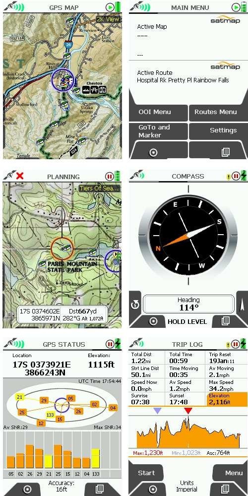
There are six main screens on the Satmap (shown clockwise from top left below) — the GPS map, main menu, compass, trip log, GPS status screen and the Planning mode screen. To access the latter, you nudge the joystick while on the GPS Map screen. The Primary Screen button (the lower right button on the unit) moves through these screens sequentially. You can also navigate them with the joystick (until you hit the map screen, where moving the joystick puts you in planning mode unless the screen is locked to prevent it). Clear as mud?
The interface is in fact so complex that I’d have to recreate the manual to fully describe it. So instead, I’m going to list some positives and negatives of the interface and features, and just lump them all together here:
Positives
- Paperless geocaching details can be transferred to unit
- Start / stop buttons on trip log screen allow you to pause track recording
- A data box overlay on the map can be toggled to show 2 or 4 data fields, giving you easy access to 6 fields
- The map can be toggled between north up, track up with your position centered on the screen, and track up with your position lower on the screen, revealing more of what lies ahead (though the latter disables the 4 data field overlay option described above)
- The backlight maxes out at 80% brightness, but the backlight boost button on the side of the unit increases it to 100% temporarily
- Areas of interest (AOIs) can be created, and you can change the background color and pattern for these areas (unfortunately it appears that shapefiles are not a directly supported format)
- Similarly, lines of interest (LOIs) can be created
- The grid overlay feature could be handy for search and rescue, but the grid size is predefined at 300 meters x 300 meters
- Red night filter mode (the sun filter seemed pretty useless to me, washing out all contour lines)
- Items of interest (IOIs) are non-geographic items that can be stored on the device. Examples cited in the manual:
“…such as a graphic showing information about a species of a bird or flower. They can also be used to reference instructions, e.g. how to make a camp fire or first aid tips.”
Negatives
- No way to show waypoints and geocaches sorted by distance
- Awkward to use with one hand
- To display a pointer showing direction to your destination, you must go to the compass screen and then press the pointer button
- Time of day only displayed in military format
- No way to customize what pages / screens are displayed
- Cannot mark geocaches as found
- No mass storage mode — requires free SatSYNC program to transfer files or convert files to .gpx format; Mac version is in beta and very limited
- It’s easy to move up or down in a list when you intend to “click” with the joystick
- The electronic compass uses a two-axis magnetometer, and so must be held level
- Displays distance in yards until you are within 100 yards, then switches to feet (when does it show miles?)
- While hibernation mode gives you a claimed 120 hour battery life, it also disables tracking
- When charging, you cannot check the charge level without disconnecting the unit
- Tracklog settings are limited (defaults to once/second; can be changed to once/4 seconds under power saving settings)
- To get the nearest point of interest (POI) or object of interest (OOI), you have to hover over a waypoint or track, press the joystick, then choose nearby, but it only shows the single nearest POI (e.g., geocache or waypoint) and nearest track, and only then if you are very close; from the manual:
“’Nearby’ is defined by an OOI reference point at a radius of:
245m (804ft) at 1:50 000
122.5m (402ft) at 1:25 000
49m (160ft) at 1:10 000”
Trail, track and route
The Satmap’s terminology here may be Euro-centric or they may have created this concentric circle of hell themselves; I’m not sure. Consider this, from the manual:
“A track is a route derived from a trail that has already been made.”
Basically, what folks here in the US know as a track or tracklog, is called a trail by Satmap. It can be converted to a .gpx track, which can be used as a route.
Unfortunately, there is a further descent into hell. The device appears to auto-generate waypoints instead of track points when you convert a trail to a track.
You can display additional tracks, er, routes, that you aren’t following, but there is this caveat:
“Showing inactive routes uses a lot of operating memory on the unit, so it is important to keep this selection to a minimum, as it will slow down your unit. Showing too many inactive routes could also ‘freeze’ your unit. Only show a few short inactive routes, or to reduce RAM consumption, choose the Show Inactive Routes SP option.”
The latter only shows the starting point of each route/track, and not the track itself.
When I saw this, I checked the memory on the device. I had one 500 geocache pocket query loaded, a dozen or so waypoints and a few tracks. That ate up 58% of flash storage!
Of Waypoints and GoTos
Tracks aren’t the only place where the terminology gets confusing. Trackpoints, those electronic breadcrumbs we know and love, are referred to as waypoints on the Satmap. Meanwhile, the destinations commonly known as waypoints are GoTos on the Satmap, not to be confused with a marker, which serves as an anchor point for measuring distance. Capiche?
Conclusion
The Satmap has some great innovative features, like the backlight boost button and availability of six data fields; and I love the big screen raster imagery. Unfortunately though, the Satmap is a rather clunky device, both in terms of form factor and interface. It is one of the most unintuitive handheld GPS receivers I have ever used. The unit suffers from poor visibility, uses confusing, non-standard terminology, isn’t waterproof, and the National Geographic map prices are usurious. While there are some positives, I cannot recommend this unit. The only people who might want to consider it are those dead set on having raster USGS topos on a larger screen than DeLorme models provide, or without the limitations of Garmin custom maps.
More Satmap Active 10 TREK reviews
- Consumer-authored Satmap Active 10 TREK reviews
have been posted at Amazon
- Unlike me, The Adventure Blog seems to actually like the Satmap Active 10 Trek
- And another positive review of the Satmap Active 10
- The following reviews are of the UK model:
- Pocket GPS World’s in-depth Satmap Active 10 review
- Outdoors magic has also posted a review of the Satmap Active 10
- Lets Go Mobile’s review of the Satmap
- BikeRadar.com’s Satmap Active 10 review
- User reviews at Amazon.co.uk
- Roam the Hills reviews the Satmap Active 10 Trek
- I’ll be posting more hands on GPS reviews as they appear, but in the meantime, here are some…
Other Satmap Active 10 TREK resources
- A PDF version of the Satmap Active 10 TREK owners manual
- More user guides, including ones for the SatSync program
- The official Satmap Active 10 TREK web page
- The UK website has a bit more info
Compare prices on the Satmap Active 10 TREK at these merchants:
- Check the current Satmap Active 10 TREK
price at Amazon
- This is a new product with limited distribution in the US; I’ll add more sources as they become available


I have had one of these GPS units for 3 years and to be honest wished I hadn’t bought it,as it came with a memory card with all 204 Ordnance Survey Landranger maps on it appeared to be good value as well as being advertised as waterproof and durable with a long battery life,but having used it I soon found out the device leaks water whilst cycling in only moderate rain due to large gaps in the screen and behind the battery cover despite having an IP65 rating and the battery life is abysmal only lasting about 12 hours with the supplied lithium ion battery with the device put into advanced power mode with a screen brightness of only 10 per cent which is not useable in sunlight,if you turn the brightness up to the required 80 percent the battery only lasts 8 hours and even less if you wake it up from hibernate mode to often which rules out using it like a paper map,also when planning you need to zoom out a lot to about 1: 250,000 or the device locks up for up to 20 seconds which is rather tedious and takes ages to plan a big route,you can plan via computer,but it doesn’t work so well with a mac besides using this feature costs extra money and is a complicated process to transfer the data,so I use a paper map and only refer to this when I am unaware of my location or want a more detailed view,but to be honest for £420.00 I think it’s way over priced especially as additional maps can cost as much as the package I already have,this device seams like a prototype,mine is in a sorry state and started to fall apart pretty quickly even though I only use it occasionally, so I advise anyone to steer clear of it,many outdoor shops in Britain have stopped selling these so that gives you some idea of how bad it is,besides SatMaps customer service is absolutely useless.