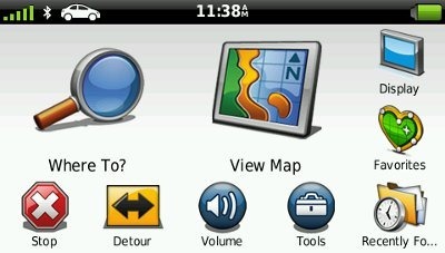
 Garmin has found another way to utilize all that real estate on 5” screens, adding customizable main menus to the nuvi 2400 series. I set up an example this morning, pictured above.
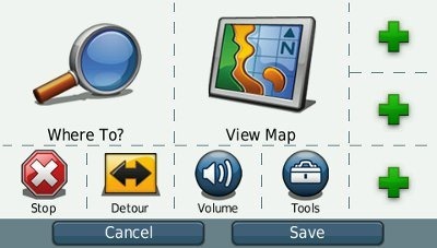
Here’s what you do — go to Tools > Settings > Main Menu and you’ll get the screen shown below. Not only can you customize the spots on the right, you can change any of the icons, including the two large ones, rearrange their position, etc.

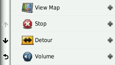
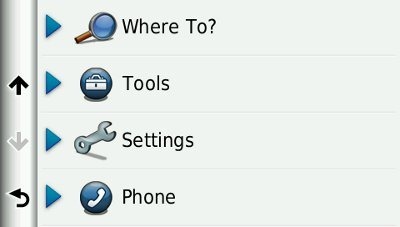
Tap a space and you’re presented with the screens below. Note that a number of the selections are nested, leading to a wider range of choices than what is shown below.


That’s it for now, but I’ll have a full review of the nuvi 2460LT coming in the next few weeks.
